Appearance
Can I customize the appearance of Reader?
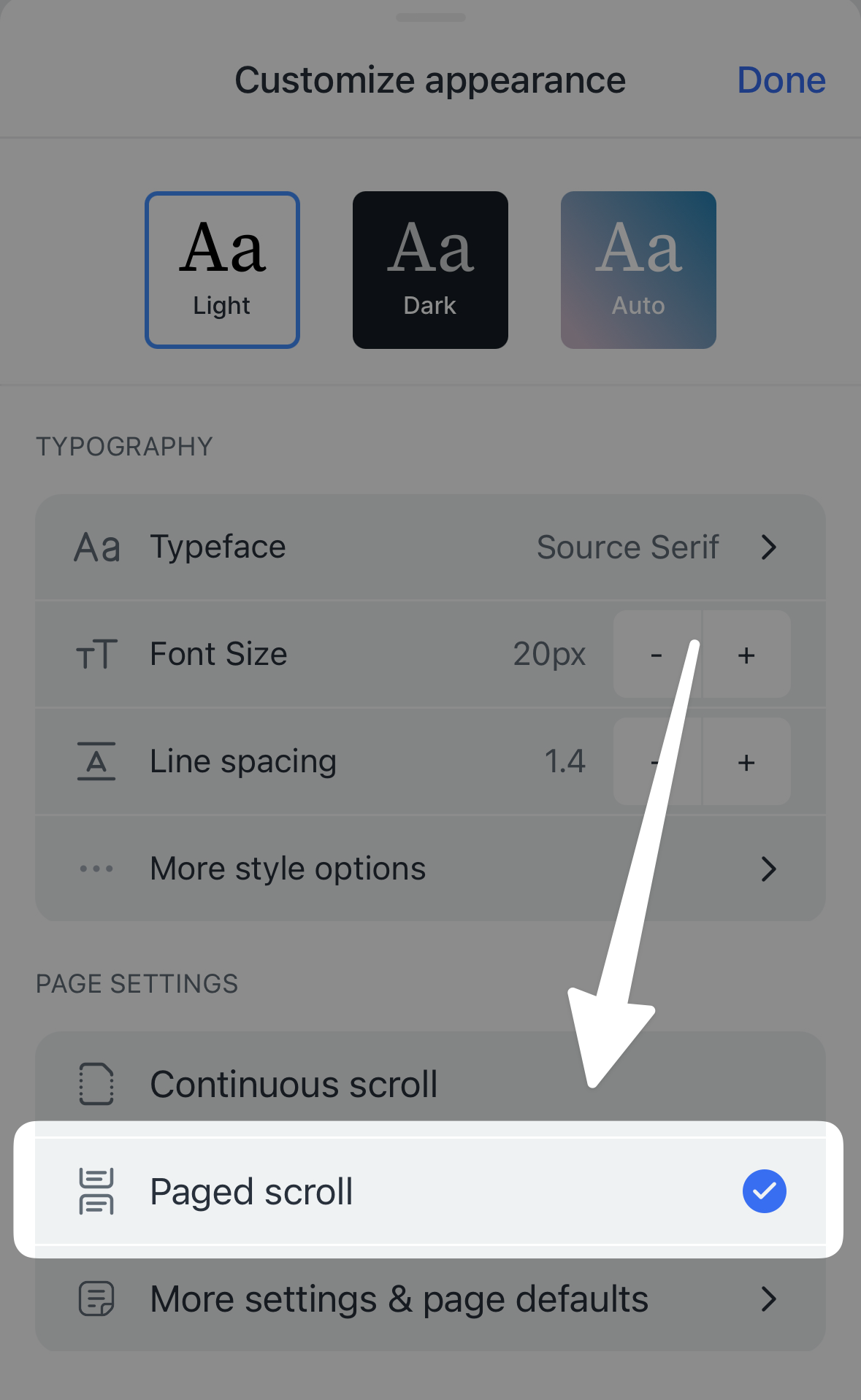
You can customize the text formatting on both web and mobile. Click the Aa icon on web, or tap into the ... menu and select Appearance on mobile, to access a variety of settings:
- Typeface: Select from a variety of serif and sans serif typefaces, including Atkinson Hyperlegible and OpenDyslexic.
- Font size: The default is 20px, but this is adjustable down to 14px and up to 80px. (
Shift + -to decrease,Shift + =to increase.) - Line spacing: Change this to adjust the amount of blank space between each line of text. Defaults to 1.4. (
Shift + :to decrease,Shift + "to increase.) - Line width (web only): Adjusts the maximum width of the document content. Defaults to medium. (Web only.
Shift + ,to decrease,Shift + .to increase.)
Does Reader have dark mode?
Reader has both light mode and dark mode, as well as an "auto" setting to detect the theme of the operating system. You can change the mode at any time from the Appearance menu, or you can use the keyboard shortcut Cmd/Ctrl + Option + T.
Can I close the side panels when I'm reading on web?
Whether you're using Reader on a device with a smaller screen or just want less clutter in your view while reading, closing the side panels is a handy trick for getting some extra screen real estate.
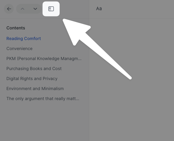
To collapse the table of contents (the left side panel), click the Hide left panel button in the top left or use the keyboard shortcut [.
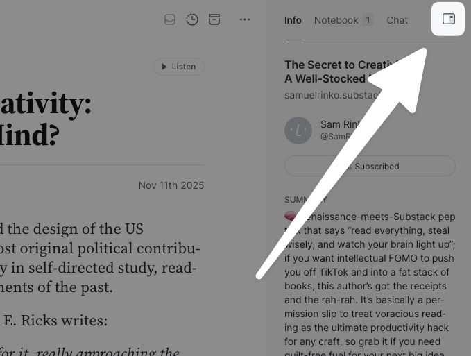
To collapse the right side panel (containing Info, Notebook, and Chat), click the Hide right panel button in the top right corner or use the keyboard shortcut ].
If you'd like either of the side panels (or both!) to be closed by default whenever you open a document, you can go to your account preferences and set the Side panel visibility by default setting to whichever option you prefer: both panels hidden, left panel hidden, or right panel hidden.
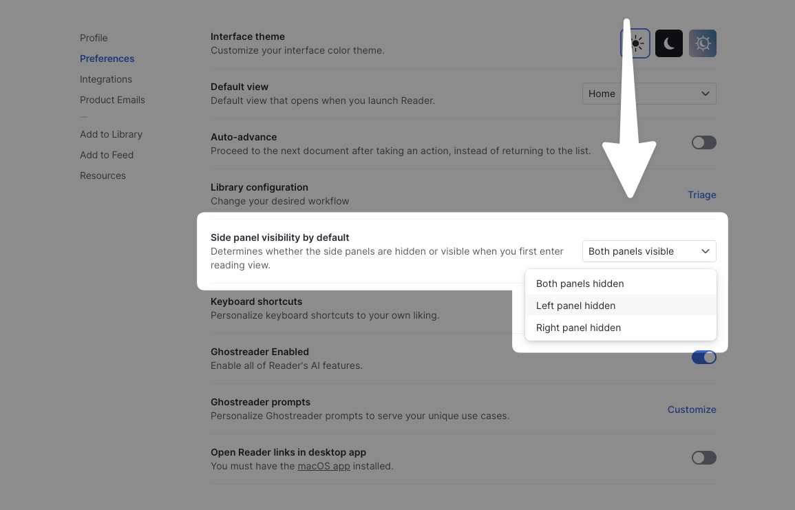
To return the setting to its default state, select the "Both panels visible" option.
Can I change the app icon?
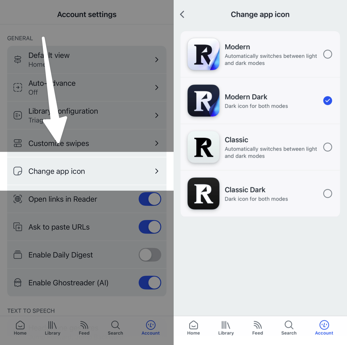
If you're using Reader on iOS, you can customize the app icon. To change which icon the app uses, go to Account settings > Change app icon and select the icon that you prefer.
How can I enable pagination for reading ebooks and other long documents?
You can toggle this feature on or off from the Appearance panel by tapping into the ... menu in the bottom right corner and selecting Appearance.
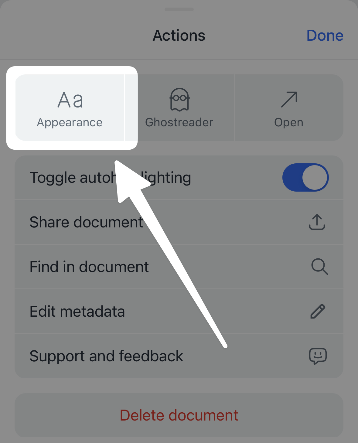
From there, you can select Paged scroll to turn on pagination.
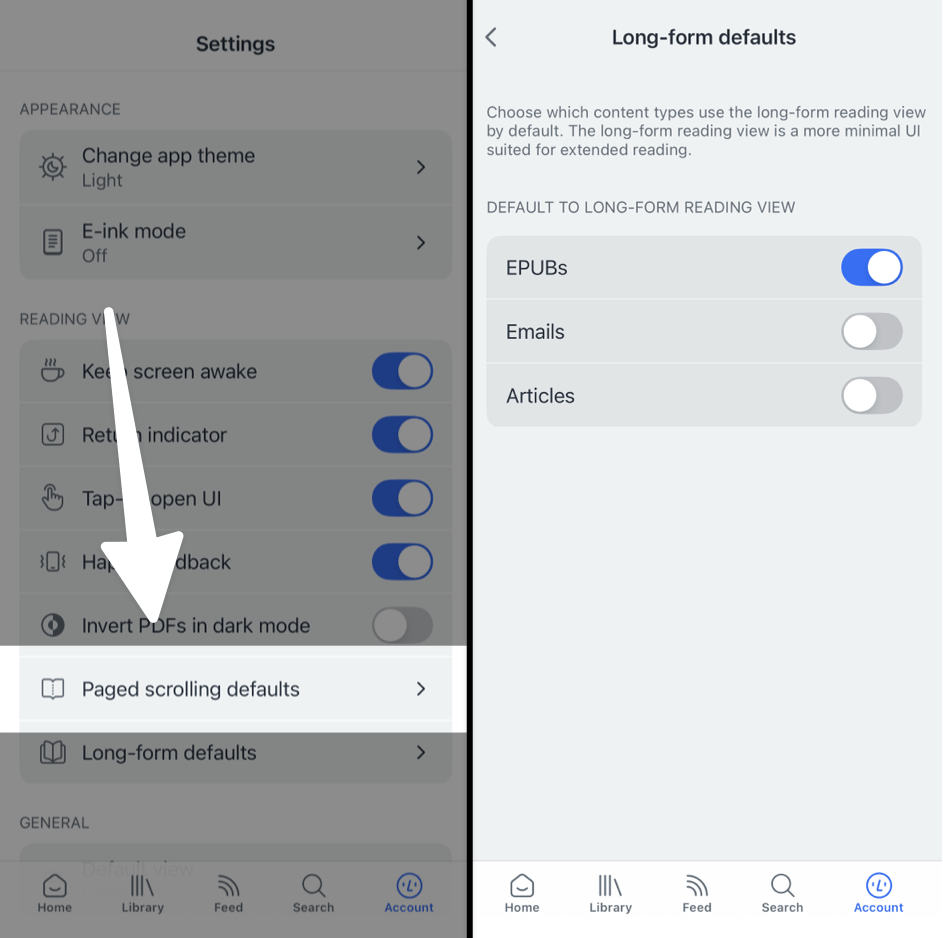
To change the default behavior of this feature, go to Account settings > Paged scrolling defaults and toggle "Default to paged scrolling" on or off for each document type.
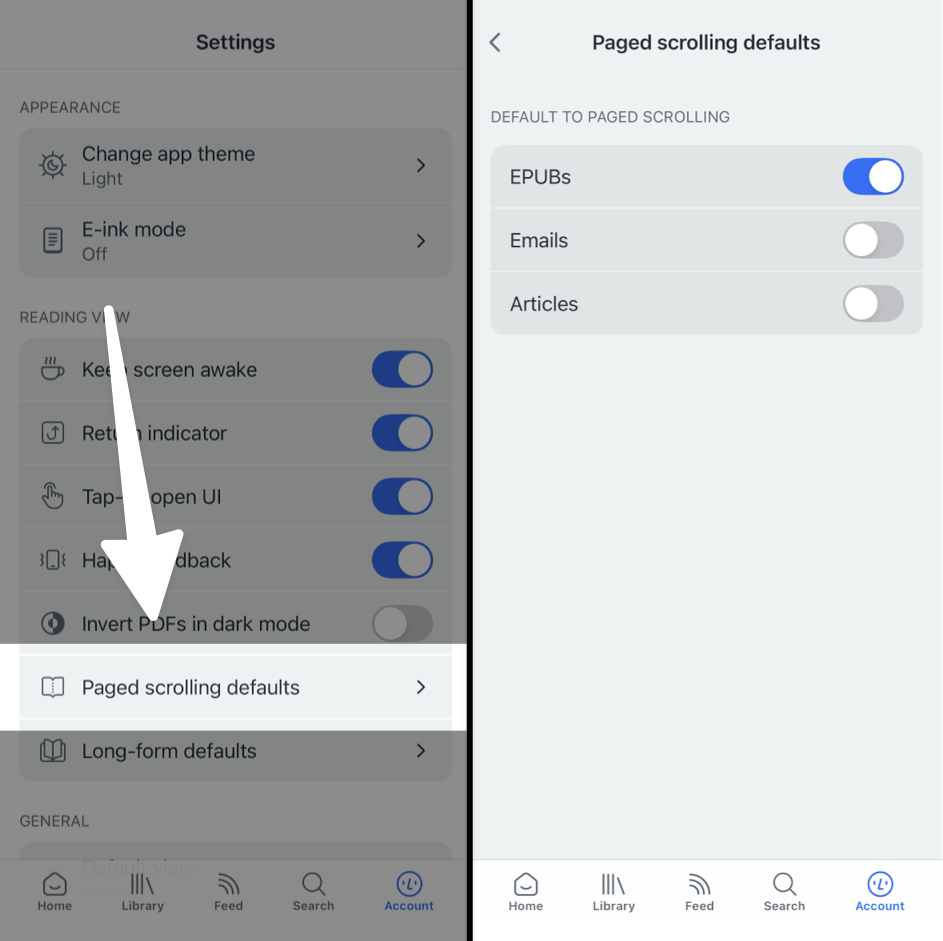
By default, EPUBs will have this option turned on, but you can adjust to suit your own preferences and the settings will be saved for any document you open on the same device.
Why is it called "paged scroll"? Why can't I swipe sideways to turn pages?
During pagination's development, we tried repeatedly to find a way to implement the UX of horizontal pagination without compromising other core functionality. Although familiar, horizontal page-flipping disrupts the user experience for a number of features, like highlighting text across pages (an often-frustrating interaction in other reading apps) or the ability to open Reader's side panels with swipe gestures.
To address these issues, we developed a vertical pagination system that allows seamless text selection and preserves swipe gestures for navigation. Although our team hotly debated the idea at first, the benefits of vertical pagination proved undeniable and we opted to implement Reader's pagination using the vertical "paged scroll" paradigm.
That said, we understand there's a lot of muscle memory in the traditional sideways swipe. With that in mind, we made sure to implement a simple "tap to turn the page" functionality that helps it feel more like other apps that use a sideways swipe. While in paged scroll mode, you can use a single tap on the left or right margins of the page to flip backward or forward.
Is there a way to make the reading view nicer for long documents and ebooks?
Yes! "Long-form reading view" is a dedicated reading layout that hides Reader's action-heavy bottom bar and elevates UI elements like reading progress and appearance settings.
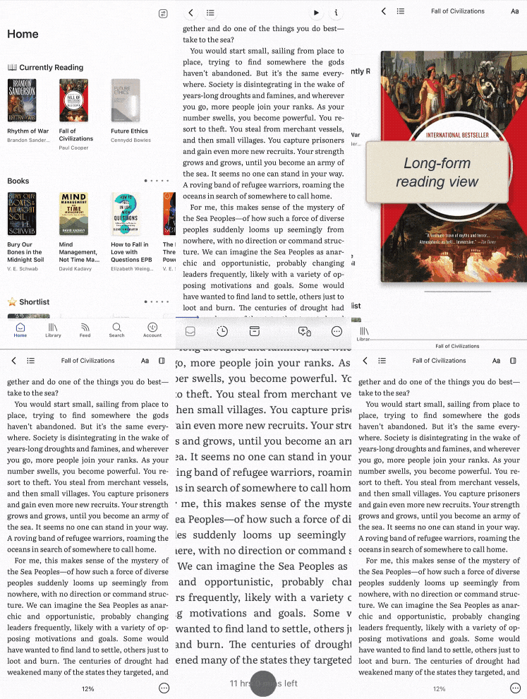
This setting is turned on for EPUBs by default, but you can turn it on or off for each document type in the Account settings > Long-form reading view menu.
How can I view my document text in two columns on a tablet?
To view the text of your document in two side-by-side columns when reading on a tablet, open the Appearance panel and select "Horizontal pagination" in the Pagination section.
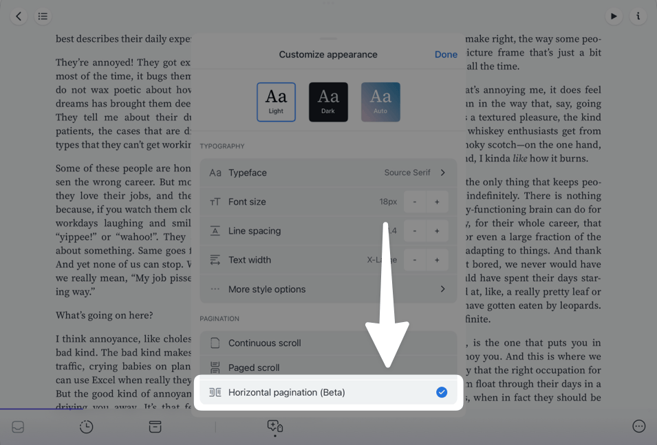
Note that the two-column view will only work if your device is in landscape (horizontal) orientation. When oriented vertically, the screen width will be too small for the two-column view to display and it will revert to a single column.
To make the visual line between the columns a bit sharper (and to make it feel more like reading a real book), you might also like to turn on justified text while reading in this view.


